Inspections and Defects
Sample Data

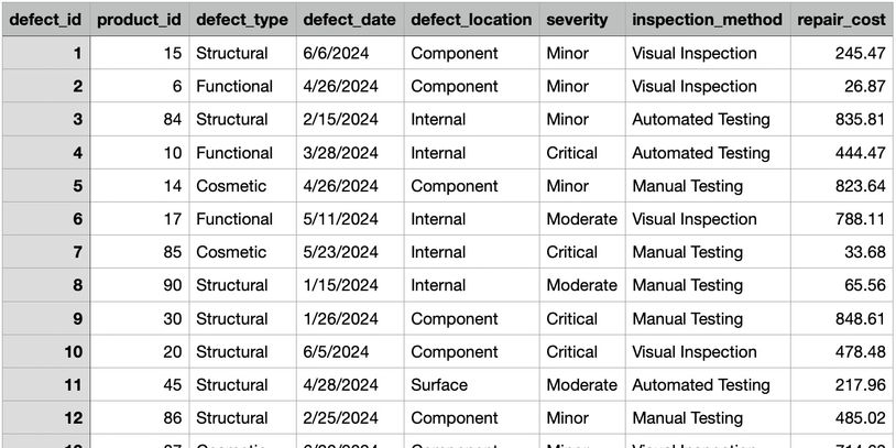
This analysis draws on 1,000 defect records collected over six months, categorized by Defect ID, Product ID, Defect Type, Defect Date, Defect Location, Severity, Inspection Method, and Repair Cost.
Quality Overview Dashboard

This Quality Overview Dashboard puts KPIs up top—Total Defect Count, Total Repair Cost, Critical Defect Rate—and the Monthly Defect Trend plus a Pareto by defect type on the bottom row.
**Real-time, fully customizable dashboards—accessible on desktop, mobile, and large-format displays
Cost Dashboard

The Cost Dashboard shows KPI - Total Repair Cost. Average Repair Cost by Defect Type as a horizontal bar chart. Repair Cost Trend as a line chart. A table that shows the Top 10 Most Expensive Defects. Lastly, a Repair Cost Distribution by Severity box plot.
**Real-time, fully customizable dashboards—accessible on desktop, mobile, and large-format displays
Inspection Effectiveness Dashboard

The Inspection Effectiveness Dashboard shows Average Repair cost by Method as a vertical bar chart. Severity Mix by Method as a stacked bar chart. Defect by Inspection Method as a table. A Heatmap of Method and Severity (Darker color indicates higher Defect Count).
**Real-time, fully customizable dashboards—accessible on desktop, mobile, and large-format displays
This website uses cookies.
We use cookies to analyze website traffic and optimize your website experience. By accepting our use of cookies, your data will be aggregated with all other user data.